This project asked us to work in groups to conduct research and redesign the new MSU library search feature and then to further come up with an idea for spreading awareness of it. Research was done to further increase the usability and accessibility of the search, as well as offer suggestions about how to spread the word and build support for this new technology.
Overview of Research
• Circulated a survey asking users about:
º Problems they encountered during their beta search
º How successful their search was
º If they preferred the old or new search
• Completed "quick and dirty" user testing
• Surveyed two librarians
• Completed proto personas
• Focus group
• Comparative analysis with University of Michigan's site and search tool
• Accessibility Review
Surveys
We created a survey on google forms asking questions for the users about what they prefer and what changes they would make. One question we asked was which search option people prefer and 100% of those we asked said they prefer the new bento box.
Librarians said that “database list” was unnecessary, that only “database” was needed
A lot of the survey results said that the tabs under the search bar were confusing; adding “jump to” would make the purpose clearer
After you’ve clicked “see more,” there’s not a clear title that tells you what page you’re on. Adding a title at the top of the “see more” view will help the user know where they are in the site and make them feel more comfortable in terms of navigation.
"quick and dirty" User Testing
Multiple users that we watched complete a beta search expressed a wish to see how many results would appear if they clicked the “see more” link. Users also talked about wishing that the “see more” link was easier to click, so we thought making a button would accomplish this and provide more clickable space. Finally, almost all users that we tested talked about the spacing in the articles bento box and how it was hard to discern where one entry stopped and another began. For our re-design, we changed the spacing to avoid confusing, and also added more contrast by making the titles of each work the darkest color.
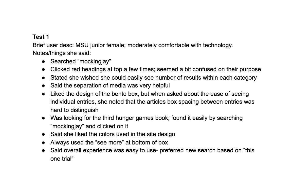
Quick and Dirty User Test Notes (1 of 3)
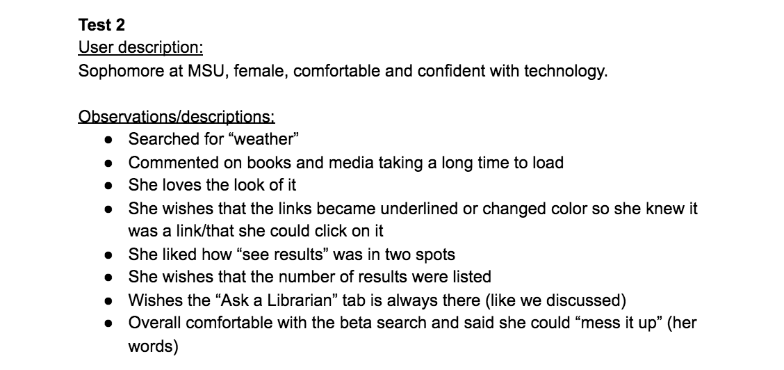
Quick and Dirty User Test Notes (2 of 3)
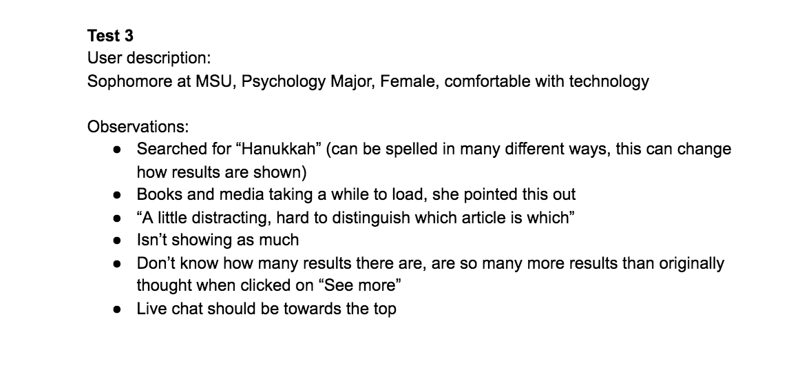
Quick and Dirty User Test Notes (3 of 3)
Personas
We created personas to further understand our targeted user group and how they would interact with the search tool. To get a range of perspectives, we created one Student, one Librarian, and one Professor for this.
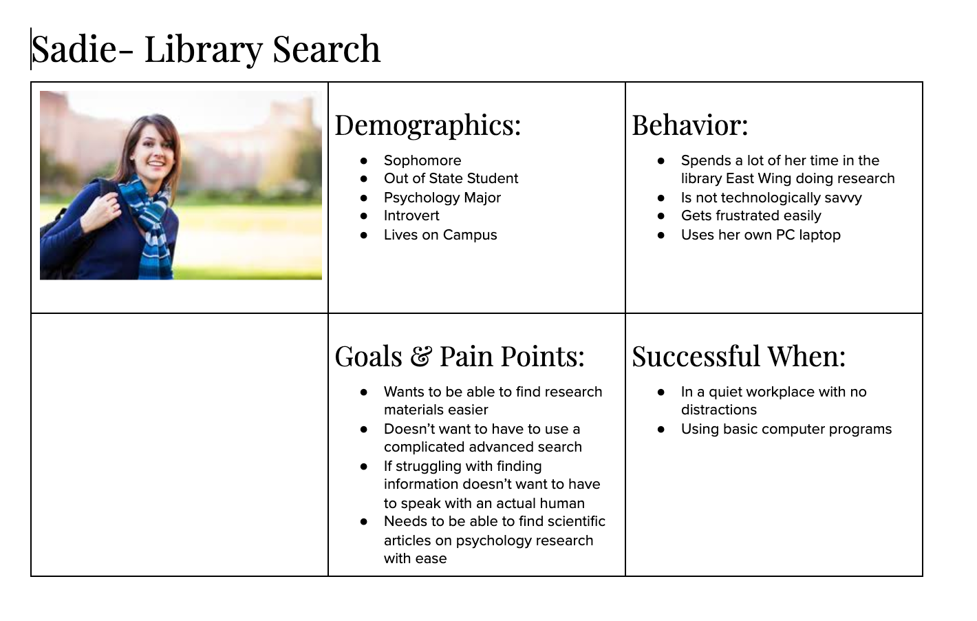
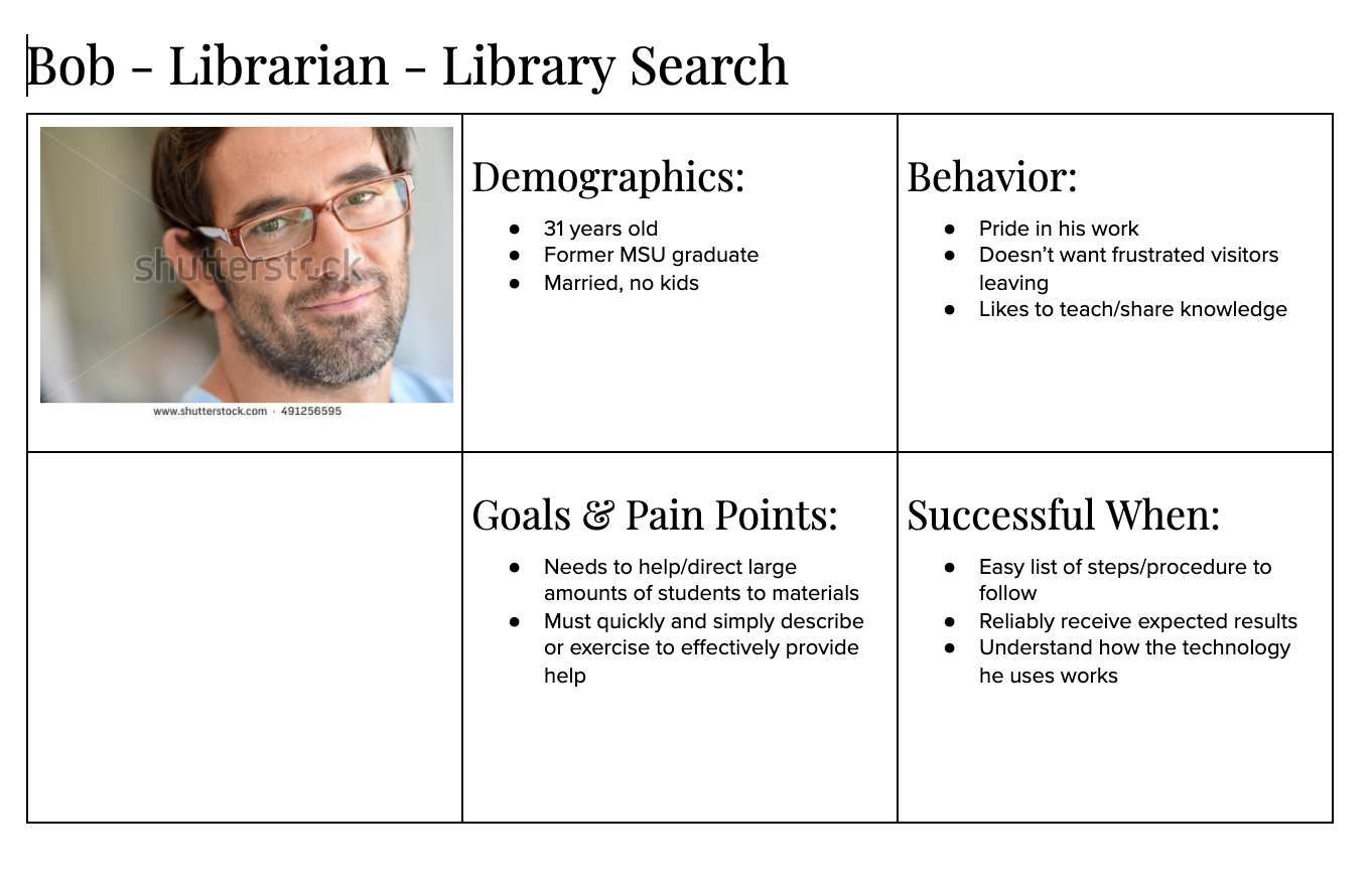
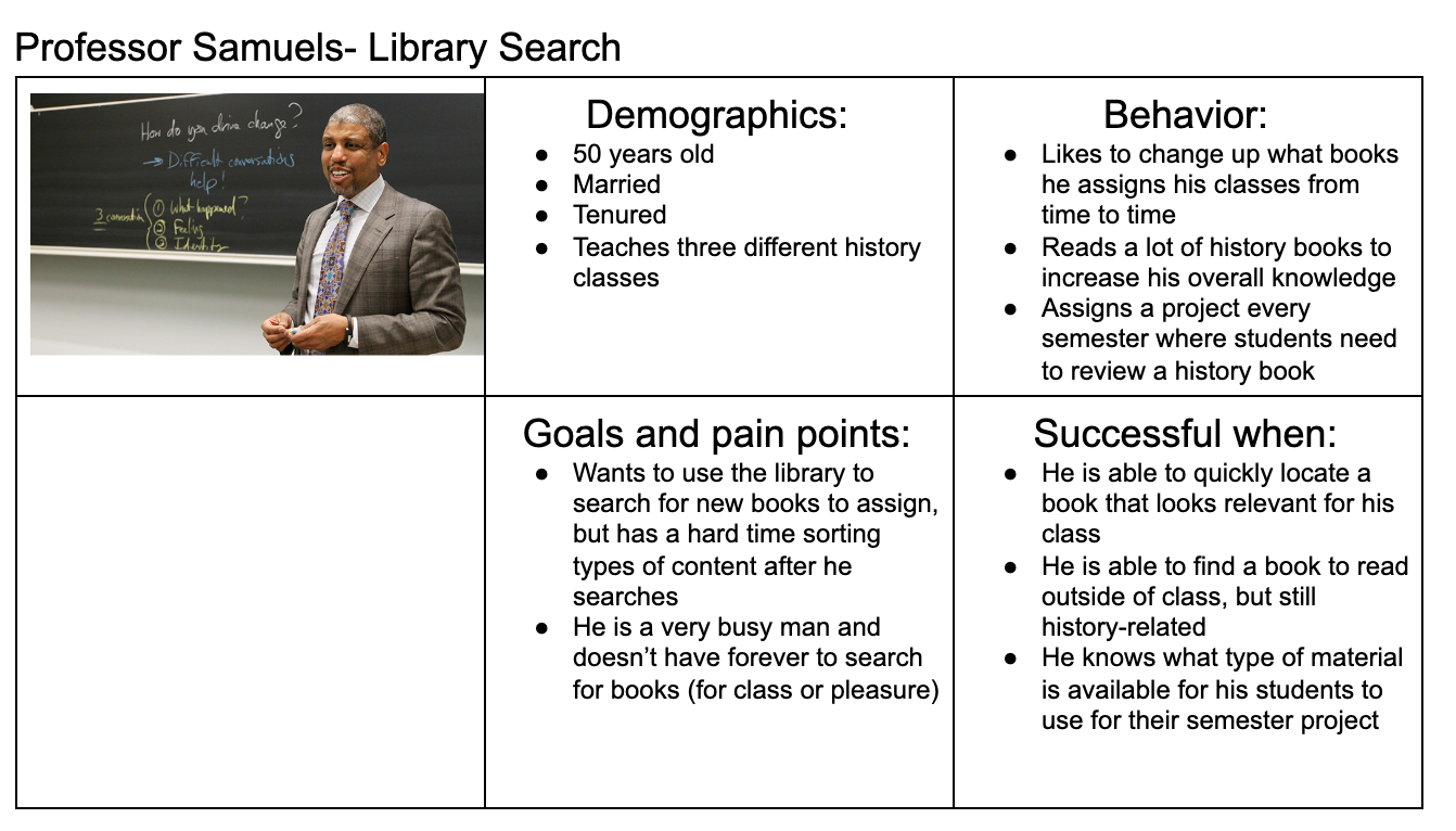
Focus Group
Takeaways:
• Bento Box is targeted towards new users, librarians have encountered frustrations with advanced users of old search bar adapting
• Catalogue is most important feature for these advanced users, but is renamed to “Books and Media” in new search bar. Difficulties finding it?
Issues Librarians wish to address:
• New lingo of search areas/links (e.g., books and media vs. catalogue, e-journals, etc.)
• Ask a librarian is in the scope of the project, feel free to pitch ideas/suggestions about it
• See what checkboxes are initially marked on searches, and see if the default ones make sense with the search itself
Accessibility Review
(full report can be found here)
A few of the WCAG 2.0 violations listed in the report include:
•Lack of error suggestion for some search results.
If a search entry like “geography” is misspelt, no results are returned, and no suggestions are provided, which significantly slows down use of the site’s core functionality to some user groups that may have difficulty with spelling, such as dyslexia.
• Link Purpose
The “Books and Media” link discussed at the focus group, in its current state, is likely a violation of link purpose, as it may leave readers confused if they end up on a “Catalog” page when following the “Books and Media” link. Something like “Books and Media Catalog” would make this connection more clear.
Summary of Suggested Changes
• Change "Database list" to "database" -> Librarian survey, more clear
• Add "jump to" or "skip to" by labels wit arrows -> Survey we circulated, some users thought these were confused
• Add into heading on top of "see more" page which bento box they just clicked -> Survey we circulated
• Have Bento Box say how many results are being displayed out of how many total results -> User testing + it might make "see more" more useful in deciding if they want to see more of if they got the jist of it
• Make sure spacing is consistent and it's easy to tell where one entry stops and a new one begins -> User testing + Improving readability
• Having a pull-out tab for the chat box that always stays on the screen -> So that users always have the option for help if they are confused, but the box isn't in the way
• Add ability to sort by author last name –> UM does this- it seems to be a standard way of organizing results that should be included
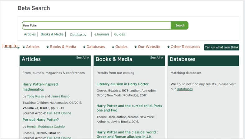
Proposed new version of the search bar with suggestions included. The "Jump to" was added onto this
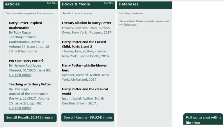
More clear separation of categories and results with improved contrast and organization
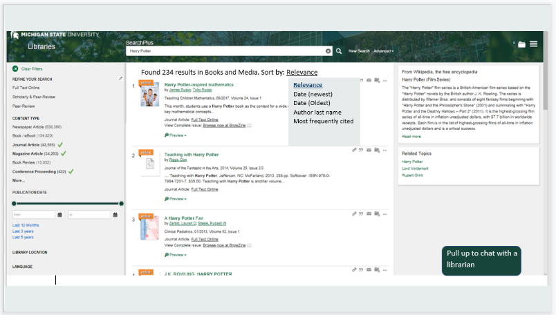
See the option to see the number of total results along with the ability to sort by author last name
Communicating New Idea
We separated our ideas into two sections for this. How to communicate the message physically and digitally.
For the physical aspect, we created a sample benefit poster. This could be included in the the dining hall on the tables with all the other upcoming weekly events centerpiece at each table. We also thought to put it into classes that would be heavily using the library and search tool, such as writing classes.
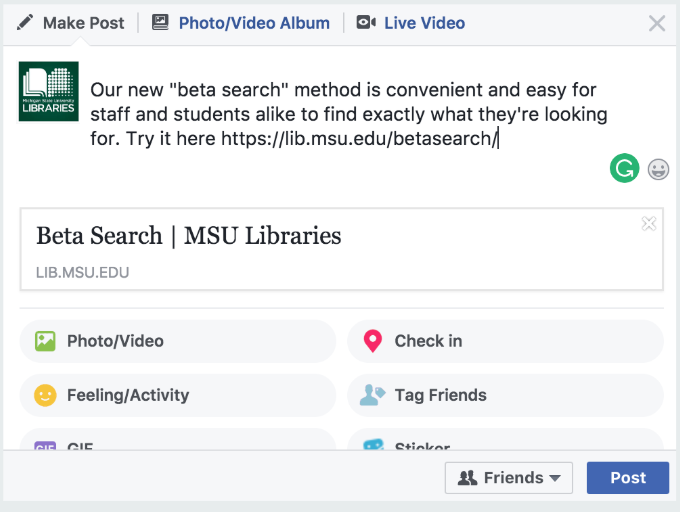
For the digital aspect, we came up with the typical ideas. An email blast to the MSU list of course, and then came up with a sample facebook post and tweet to share on social media.
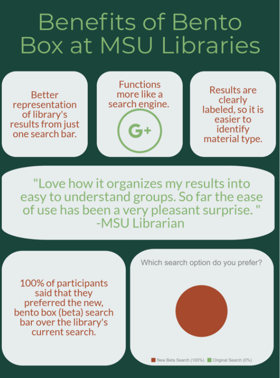
Sample Poster
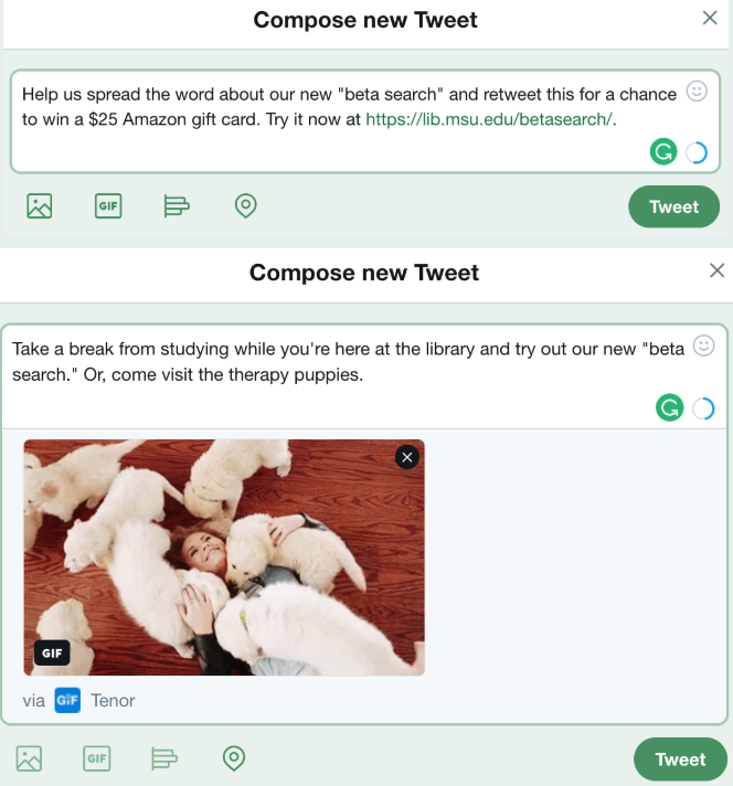
Sample Tweet
