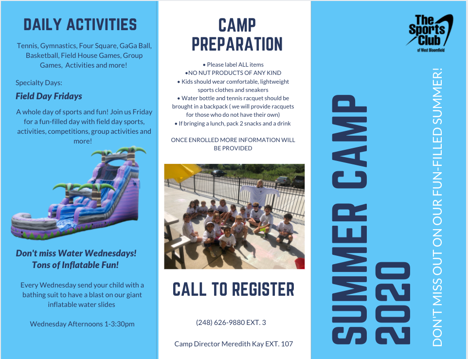
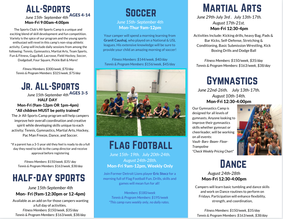
For this project, I was asked to redesign the summer camp brochure to be more aesthetically pleasing and to better reflect the company's brand.
The original brochure is shown below.
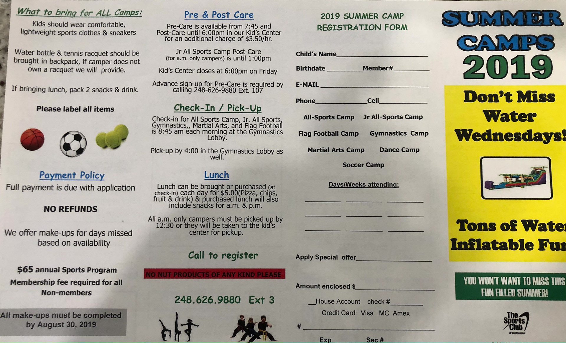
Original Brochure (1/2)
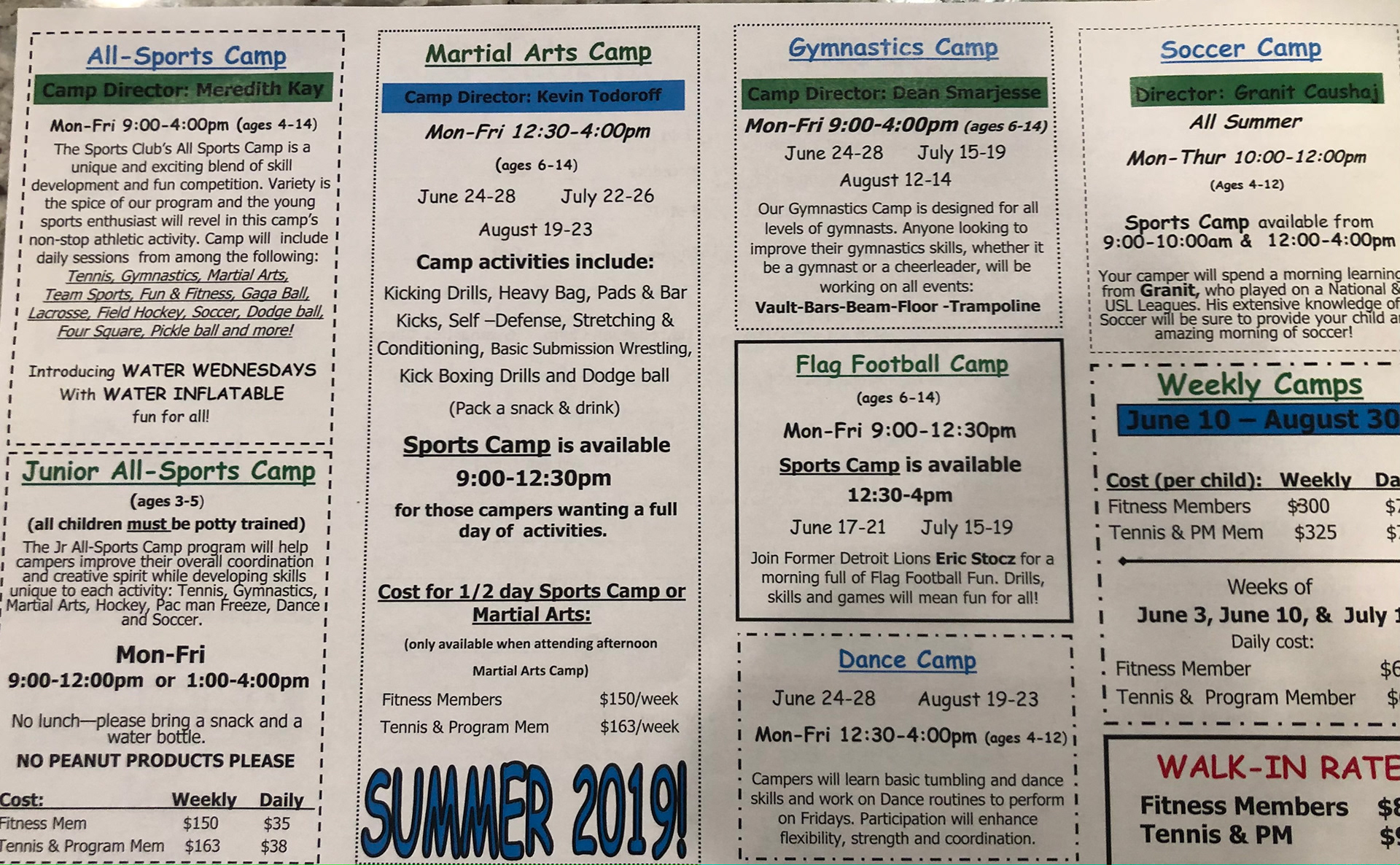
Original Brochure (2/2)
Summary of Changes
• Created a typographic theme to use, less fonts = less distracting
• Stuck to a color scheme based on the inside of the club
• Used a combination of real images from camp
• Restyled and regrouped categories of information
• Created a separate flyer just for a quick glance at pricing
• Used the club's logo
