For the project, myself along with three others were tasked with redesigning the website for a physical space located within the Michigan State library. The original site was a poor reflection of the great tools and new technology available to students.
Phases of the Overall Research Project
1. Stakeholder Meeting and notes
2. Interviewing
3. Personas and Scenarios
4. Card Sorting
5. Heuristic Analysis (on Digital Scholarship Lab website)
6. Competitive Heuristic Analysis
7. Wireframing
8. Developing a Prototype
9. Usability Testing
10. Creating an Accessibility Style Guide
Our Research questions were questions that would determine what part(s) of the DSL website needed to be improved and how. Each phase (card sorting and then heuristic analysis, and then wireframing, etc) of research in this semester long project gave us more and more “answers” (in the form of data) to these questions.
Research Questions
1. What areas of the site do users have trouble navigating?
2. What content is most important to users of the physical spaces, and is this content the same of different from what content is most important to users of the digital space?
a. What physical spaces are prioritized by users and why?
i. Are users of the physical space aware of the other features of the space and do they care?
ii. What could draw them in if they don't care?
b. Is there content that can be added or eliminated in order to better align with the user's needs?
3. Optimal Sitemap organization, navigation needs improvement
4. How is the space being used?
We came up with our interview questions below based off of our four overall research questions. Our interview questions determined people’s knowledge of the DSL and their impression of its website. We conducted interviews outside of the DSL, but still in the library, to determine if people that came to the library knew about the DSL/its website or not. We conducted interviews inside the DSL to determine people’s impression of the DSL and what it has to offer, as well as people’s impression of the website. This is important because it tells us what kind of content should be displayed or not displayed on the website, based on what people tend to know (or not know) about the DSL. The data from the interview questions provided us with the information that we needed to move forward to the next phase of the semester long project (Personas), and closer to completely answering our research questions.
Interview Questions
Basic Interview Questions (Note: Follow up Questions removed)
1. Are you familiar with the Digital Scholarship Lab?
2. Have you ever used the space before?
3. Do you want to learn more about the Digital Scholarship Lab spaces or website?
4. (IF IN DSL) What brought you to the Digital Scholarship Lab today?
5. (IF NOT IN DSL) Why did you choose this space over the Digital Scholarship Lab?
6. Have you used the Digital Scholarship Library's website before?
7. What information would you expect to find / would be most useful to you on the MSU Digital Scholarship Lab website?
8. After Looking at the homepage of the website for the first time, is there any content that is missing that should be there?
9. Are there any resources missing that you wish were there?
Results of the Interviewing Phase
3 Main Findings:
1. MSU students that go to the library don't feel like they are welcome to enter the DSL in the same way that they are able to in the rest of the spaces in the library
2. Main uses of the website are for finding the DSL hours, and what kind of technology + software is available in the DSL
3. Need pictures of the space so people know what to expect before coming to the DSL
Personas and Scenarios
Various versions of people who were the target audience group for who would access the digital scholarship lab. A diverse range of technology and majors were paid attention to in order to account for the large school body.
This was really to help us understand further our users and their goals with the space.
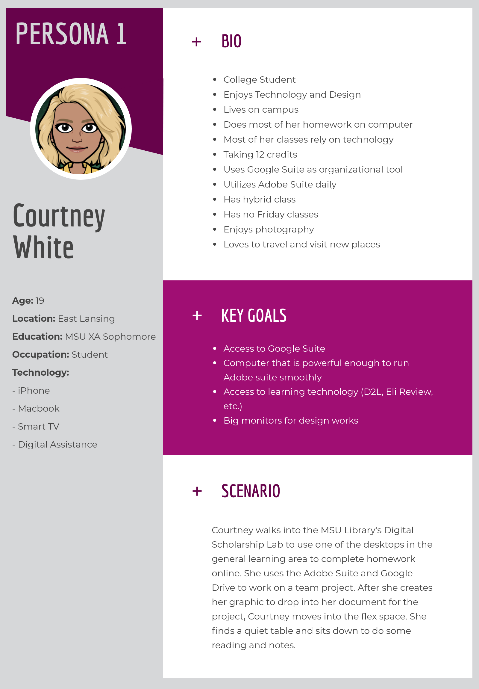
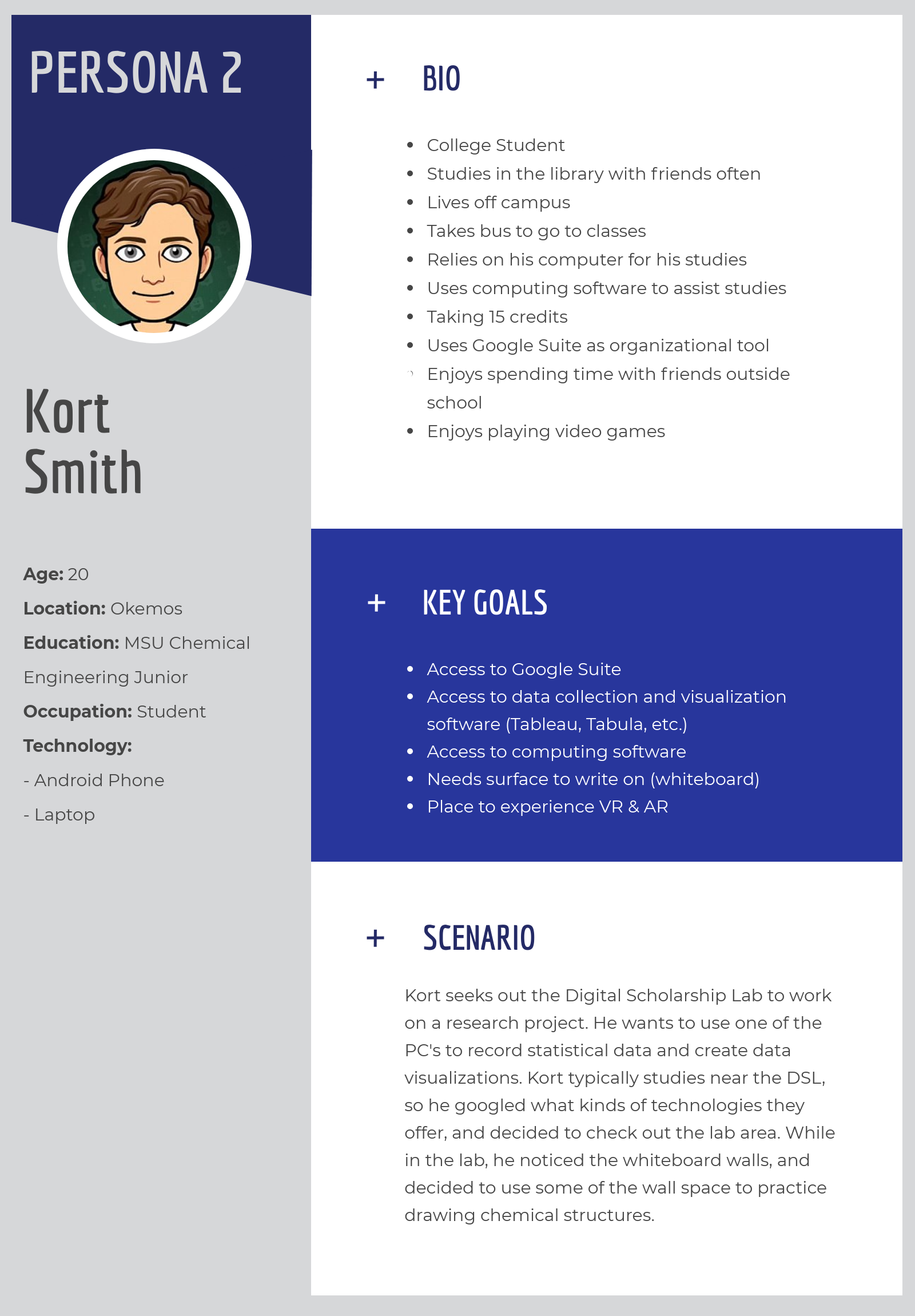
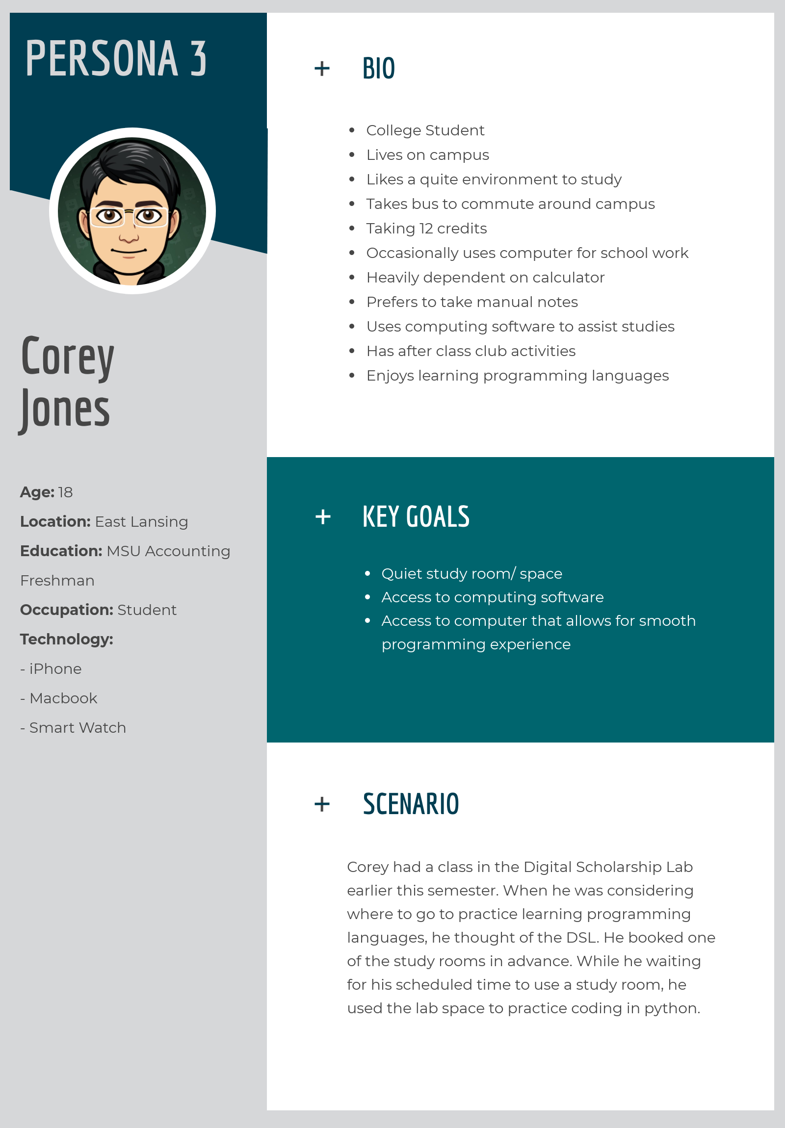
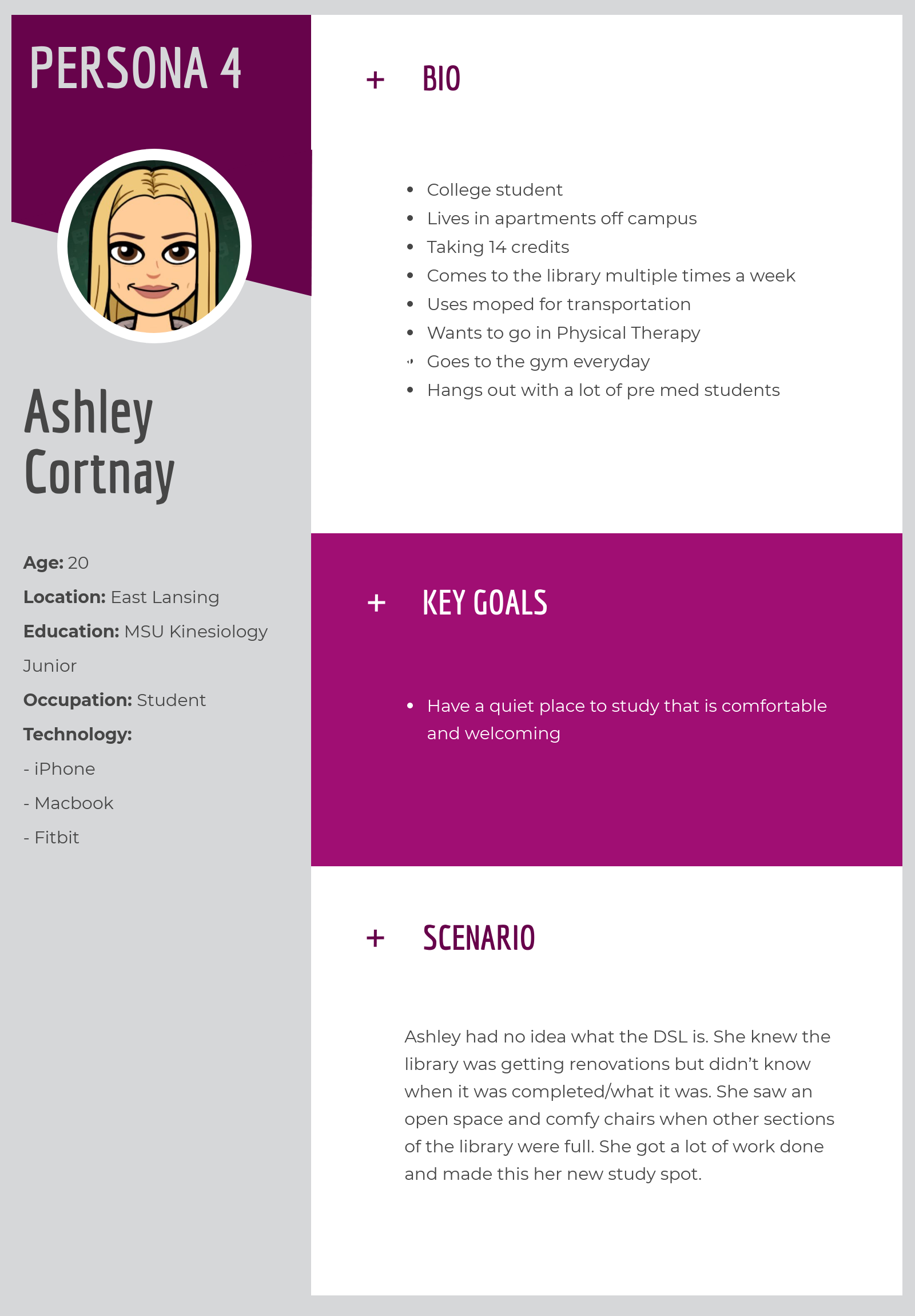
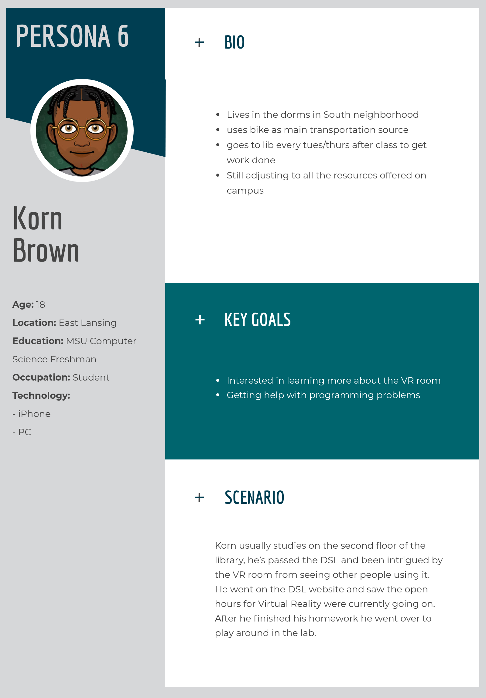
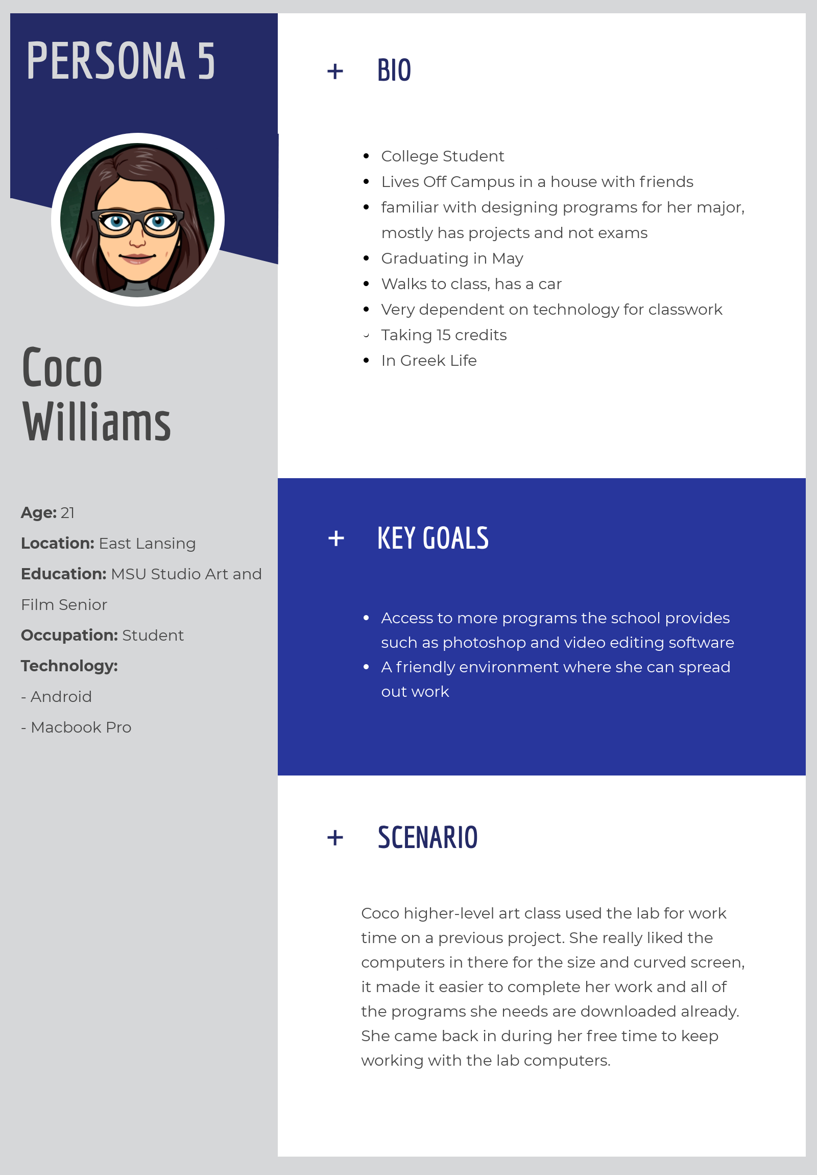
Takeaways from Creating Personas
• Room for improvements is the form of more diverse personas
• User Values:
º Find out available technology
º Access to available technology
º Assistive softwares for school work
º Access to study space
Card-Sorting Activity
For this, we performed two different versions. The first version was a physical card sort activity in which the participants were given a stack of note cards with titles of them found from the headers and sections of the then-current DSL website. We instructed them to group together categories how they saw fit together and then afterward to give each section a title name.
After receiving the results from those, our group combined similar names for category titles and incorporated those into our Hybrid Online Card Sort.
The Hybrid Card Sort link we sent out with a short preliminary survey. The link can be found by clicking here.
After collecting the results from both activities, we were able to reorganize the content from the original site design.
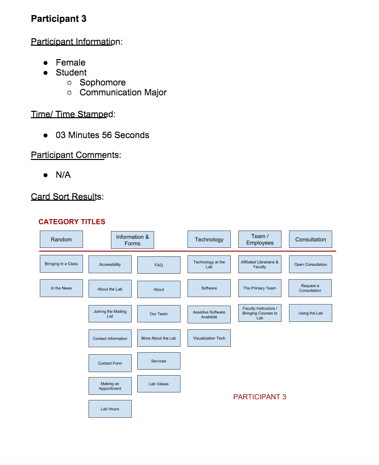
Physical Open Card Sort Activity Results from Participant
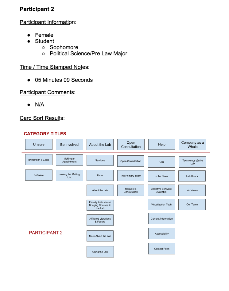
Physical Open Card Sort Activity Results
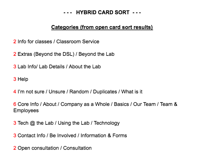
Results from Open Card Sort Results. The red number indicates the number of people that had put a similar answer to create each title
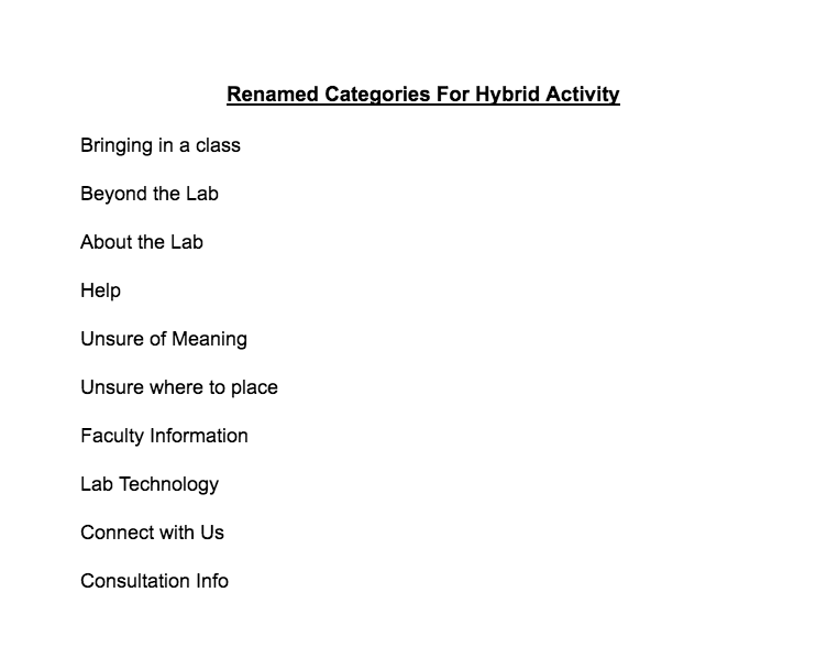
These are the titles we used for the Hybrid activity
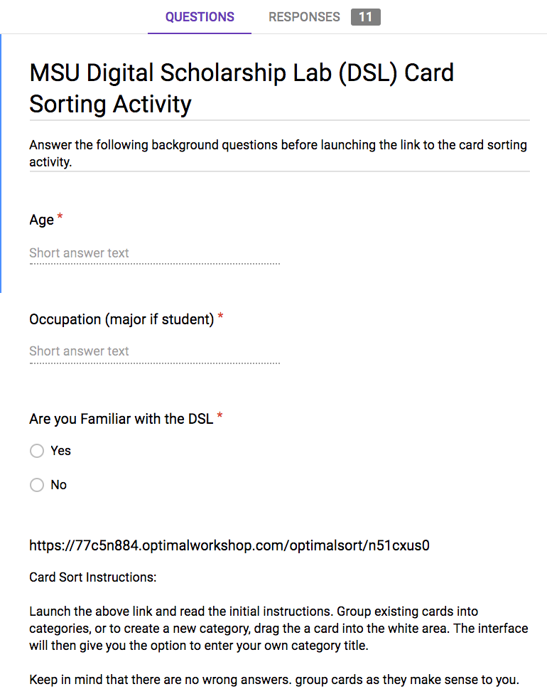
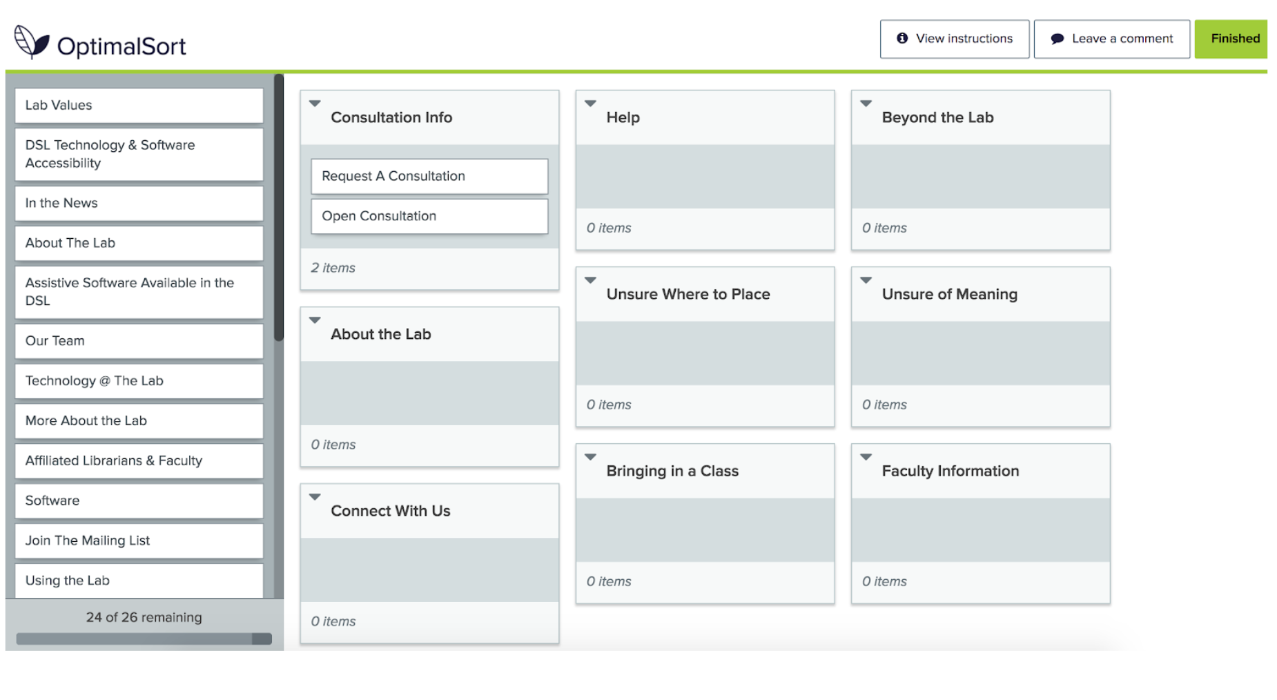
Example of how the hybrid card sort activity appears,
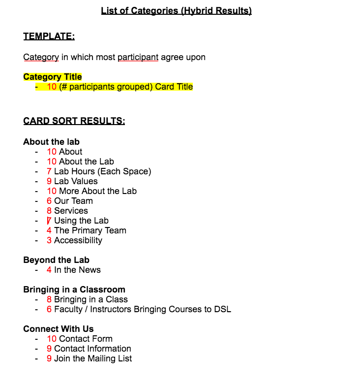
Results from the Hybrid Online activity. The red number indicates the amount of similar results that were combined to create each new category title
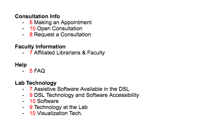
Online Hybrid Results continued
Final Renamed Categories
• Bringing in a Class
• Beyond the Lab
• About the Lab
• Help
• Faculty Info
• Lab Technology
• Connect With Us
• Consultation Info
Heuristic Analysis
Individual Heuristic Analysis was performed using the grading skill of 1-5, (5 being great, nearly no room for improvement and 1 being in need of improvement). After this was performed my group came together and compared the ones that we graded lower scores, and regions where we had a large range of what we graded separately and in need of discussion. This is how we determined what areas of the site we should focus on.
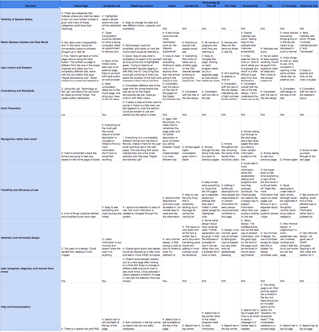
Heuristic analysis spreadsheet
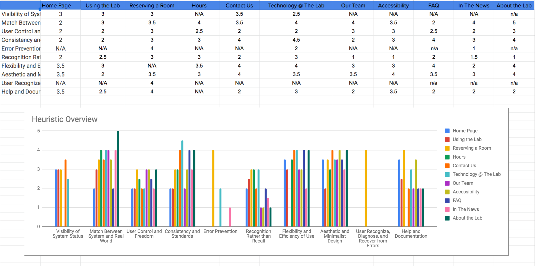
This is the averages of our scores for each area of the site
Competitive Heuristic Analysis
Individual Competitive Heuristic Analysis was also performed. We compared with sites that were of the same style and same purpose, one from the same branding, and then indirectly but we chose Lansing Urgent Care for it's "booking an appointment" feature
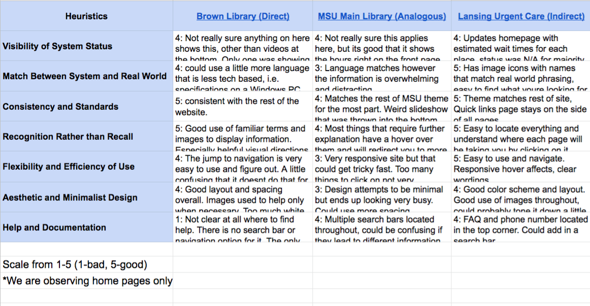
My individual heuristic analysis spreadsheet
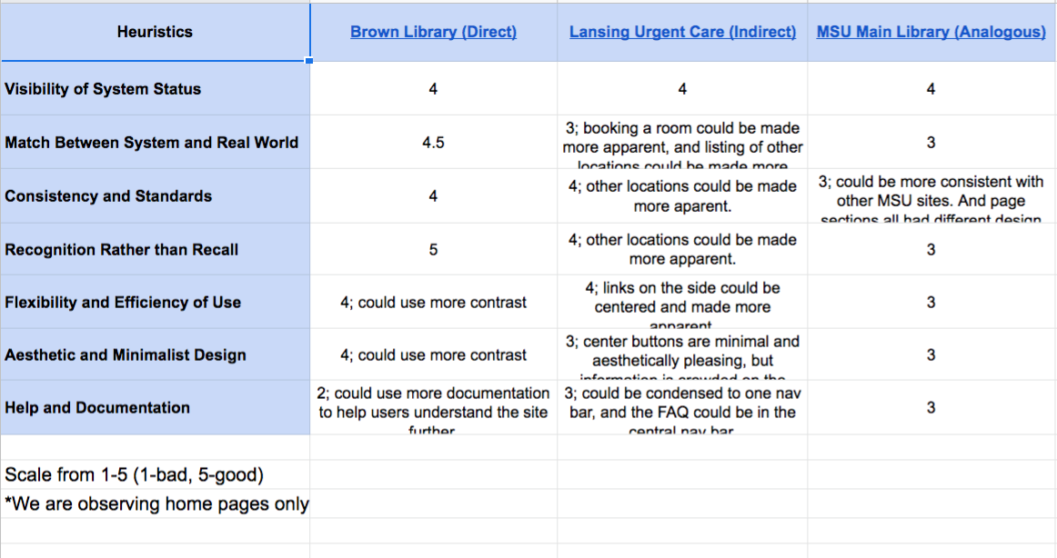
Our group came together again to discuss our decisions for the grading scale.
Wireframing
Individual Wireframe Sketches were done for the pages that we determined needed the most improvement based on our User Testing. We came together to create a group wireframe, and from there a prototype of the redesigned site.
Prototype can be found by clicking HERE- https://www.figma.com/proto/cfNABOa1ozizSItXfjVqNA66/Untitled?node-id=1%3A2&scaling=min-zoom&redirected=1
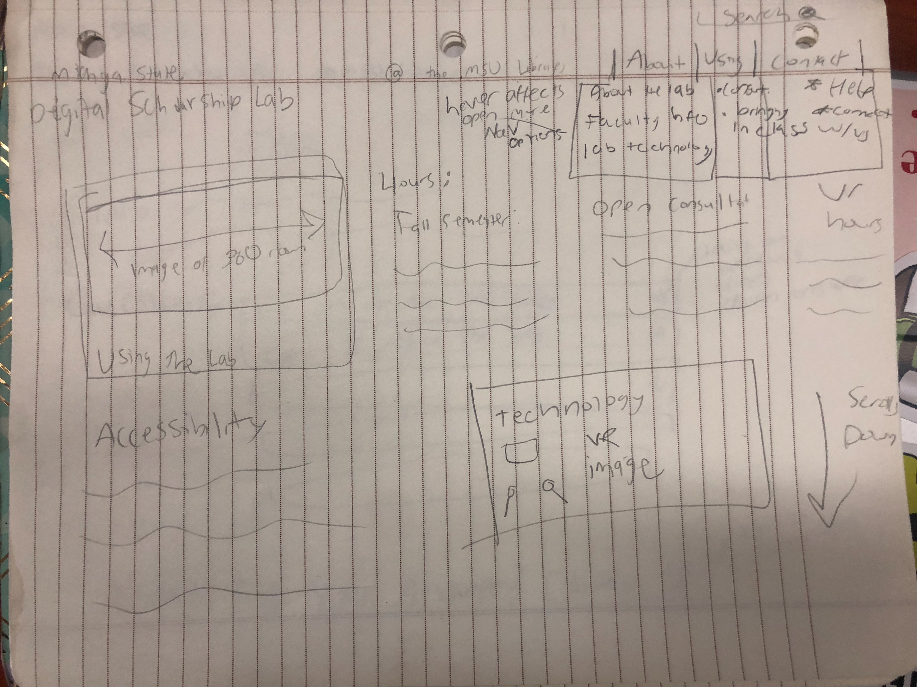
DSL homepage individual wireframe sketch
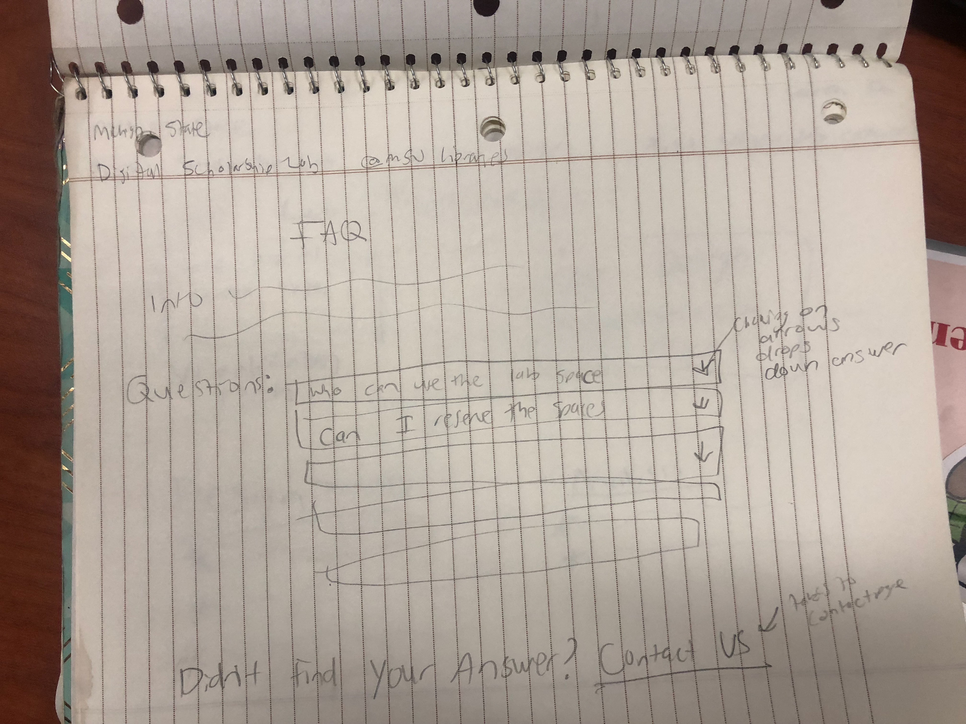
FAQ page individual wireframe sketch
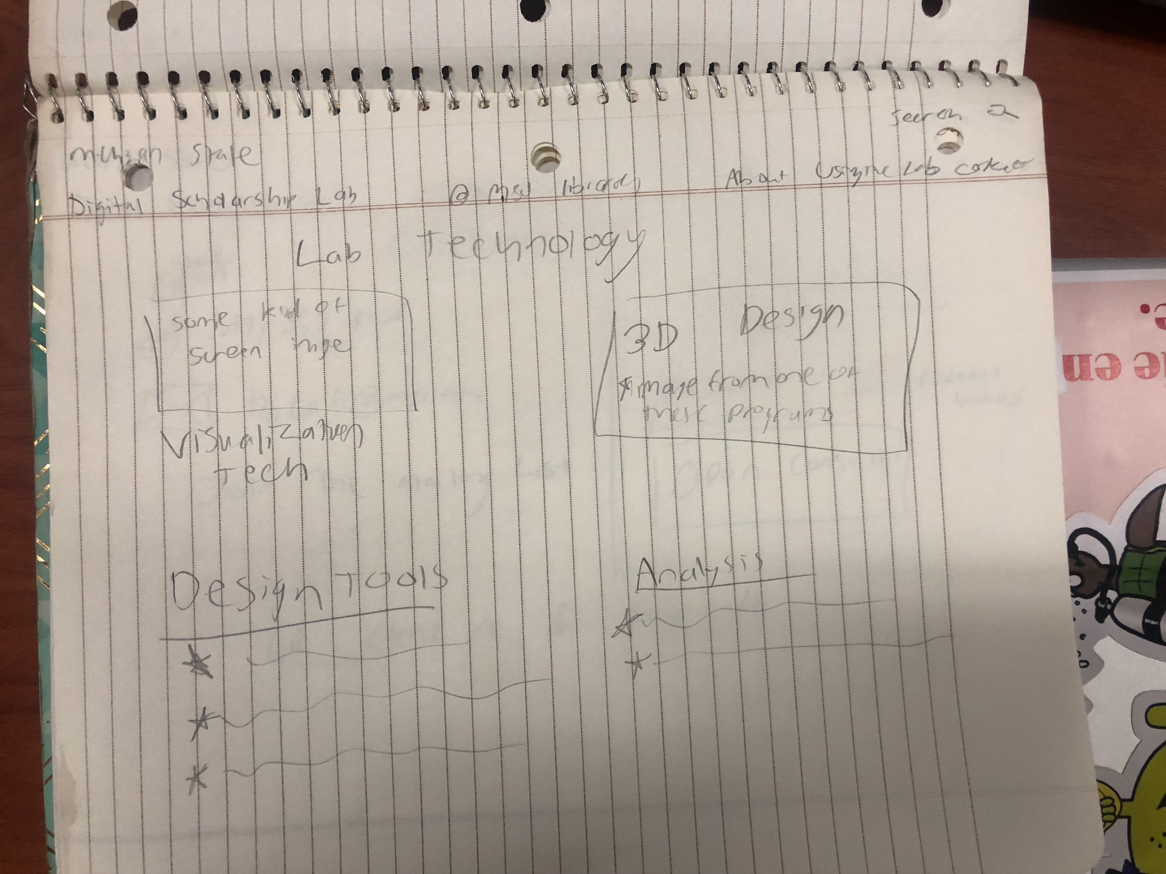
Lab Technology page individual wireframe sketch
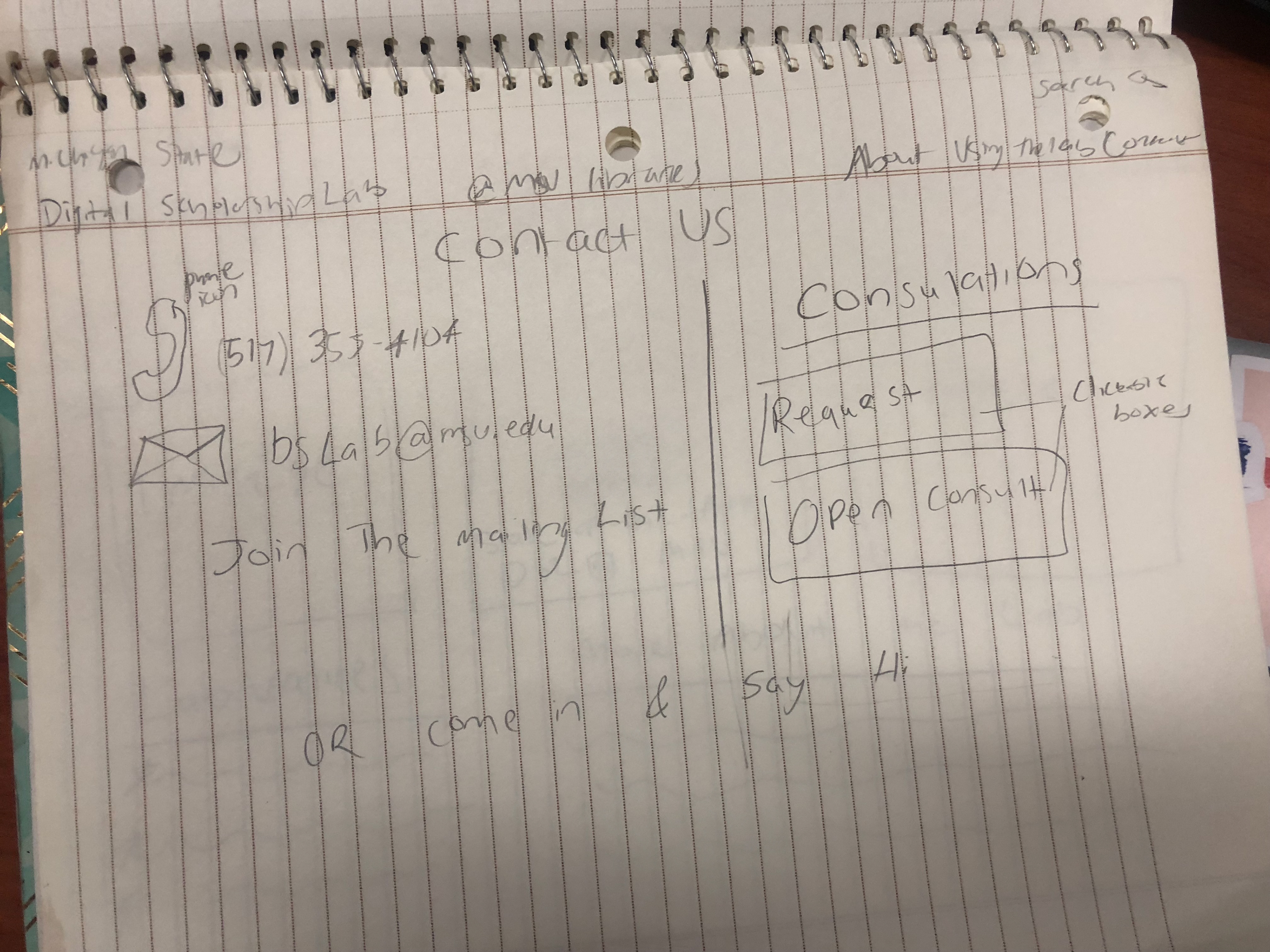
Contact Us individual wireframe sketch
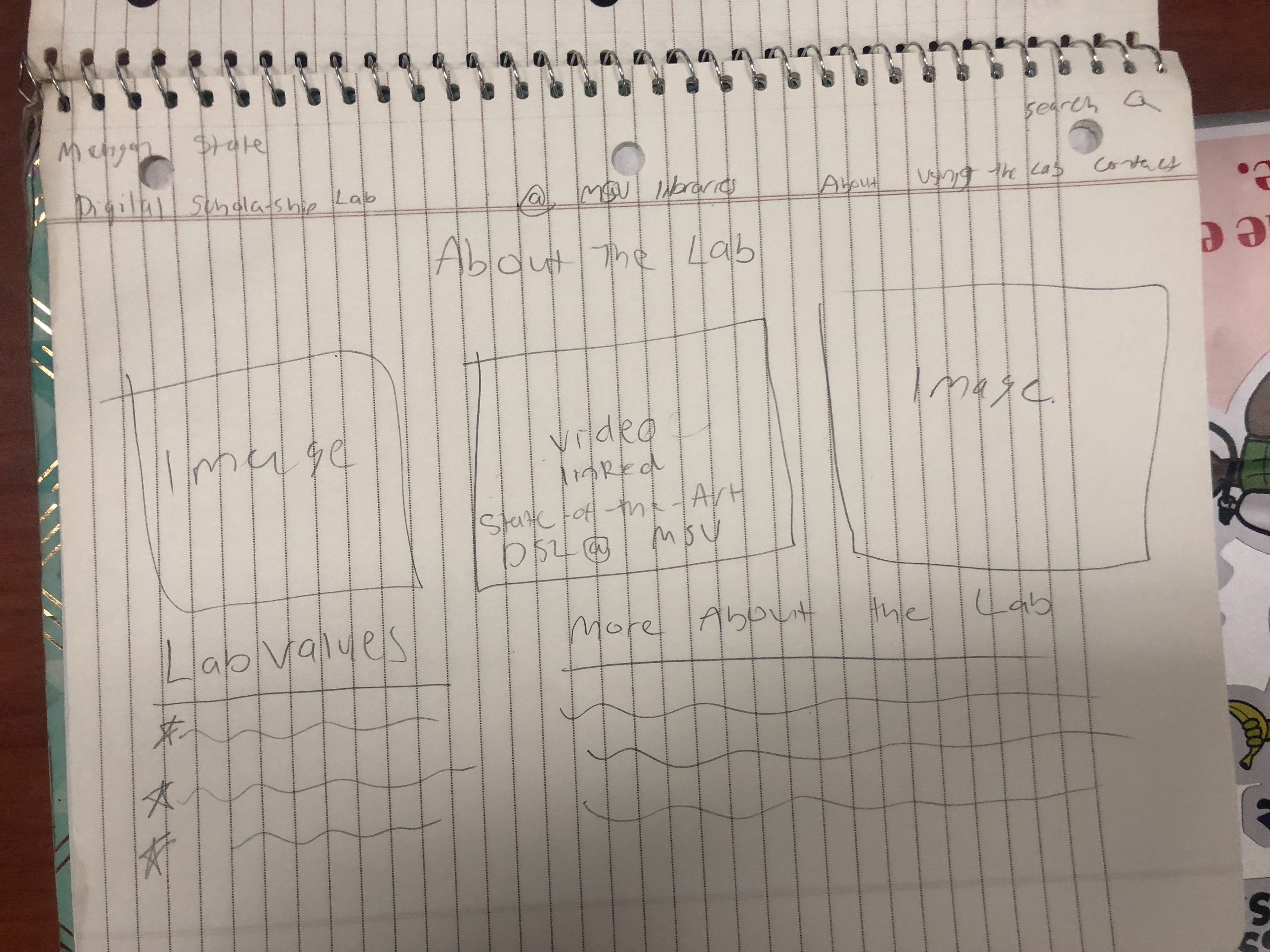
About the Labe individual wireframe sketch
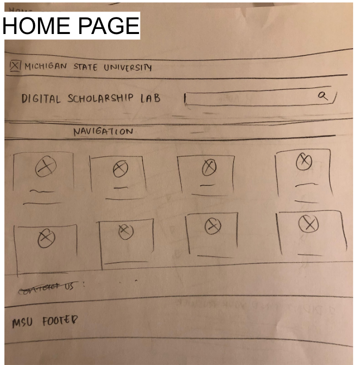
Home Page Group Wireframe
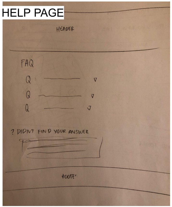
Help Page Group Wireframe
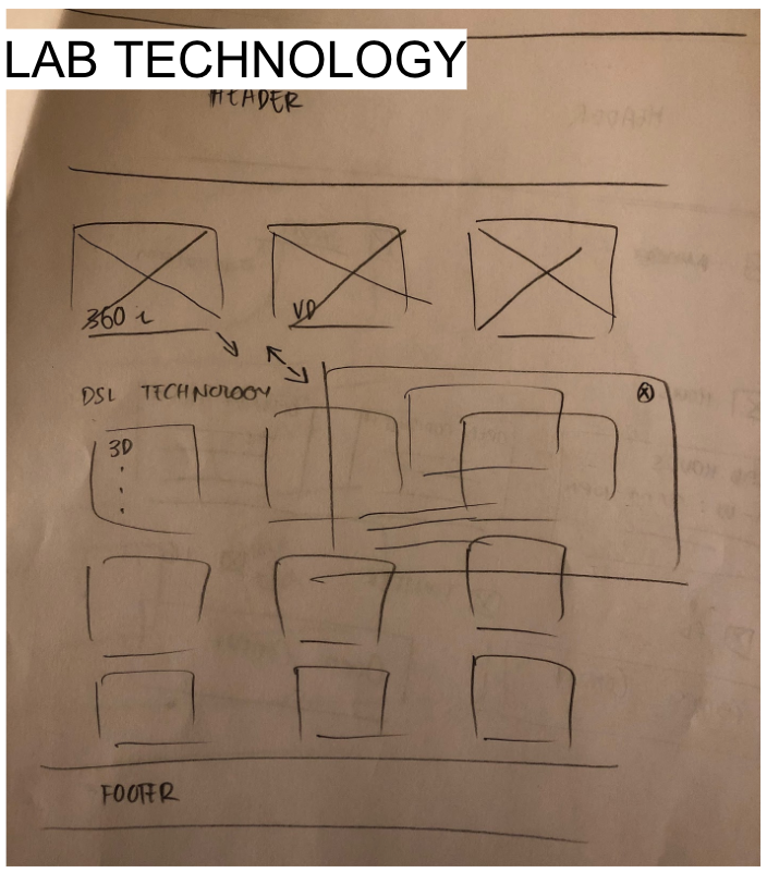
Lab Technology Page Group Wireframe
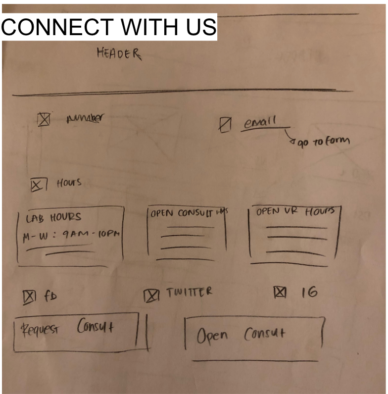
Connect With Us Page Group Wireframe
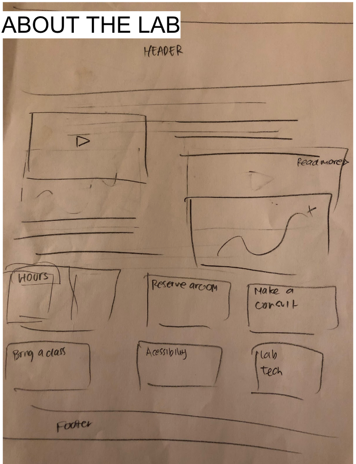
About the Lab Page Group Wireframe
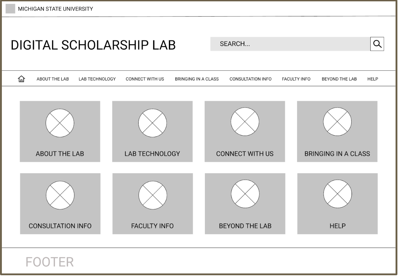
Home Page on Final Prototype
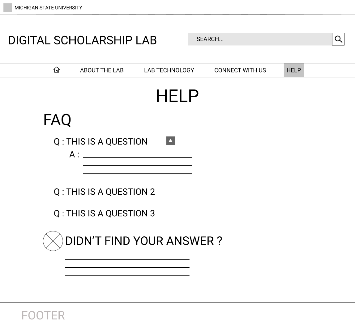
Help Page on Final Prototype
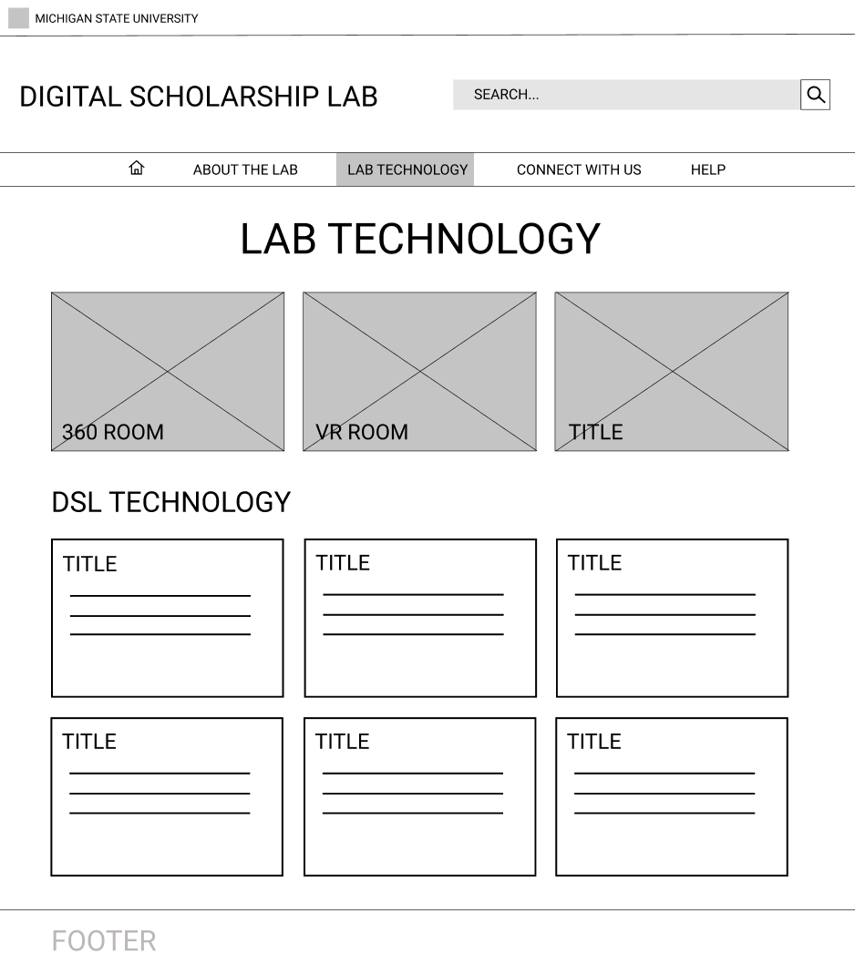
Lab Technology Page on Final Prototype
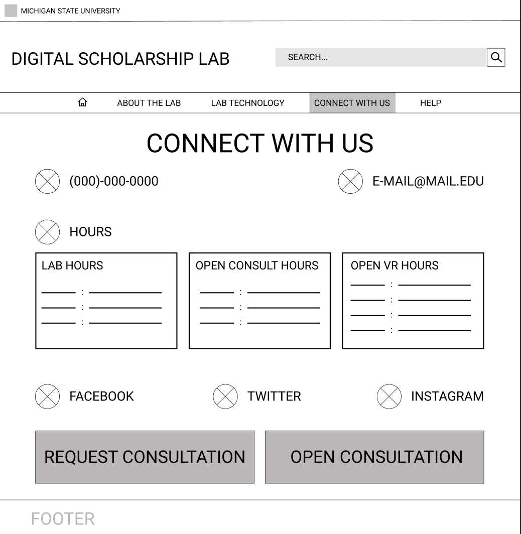
Connect With Us Page on Final Prototype
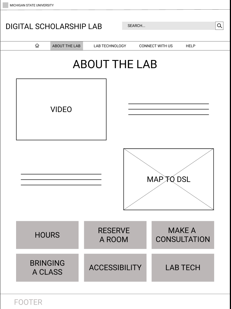
About the Lab Page on Final Prototype
Final Survey
After creating our final prototype, we sent out one final survey to see how people felt about the new site design.
Most users had a good impression of the prototype. One user even said that everything was located where it was supposed to be.
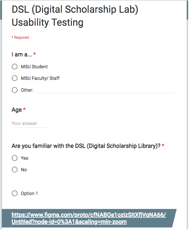
Preliminary Background Information
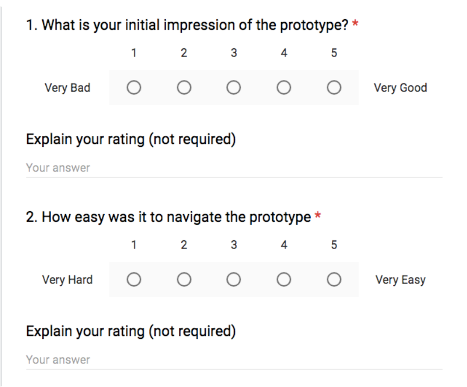
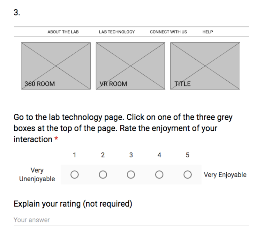
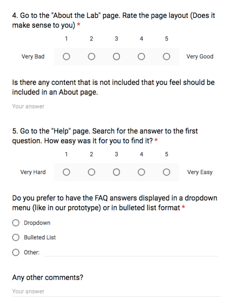
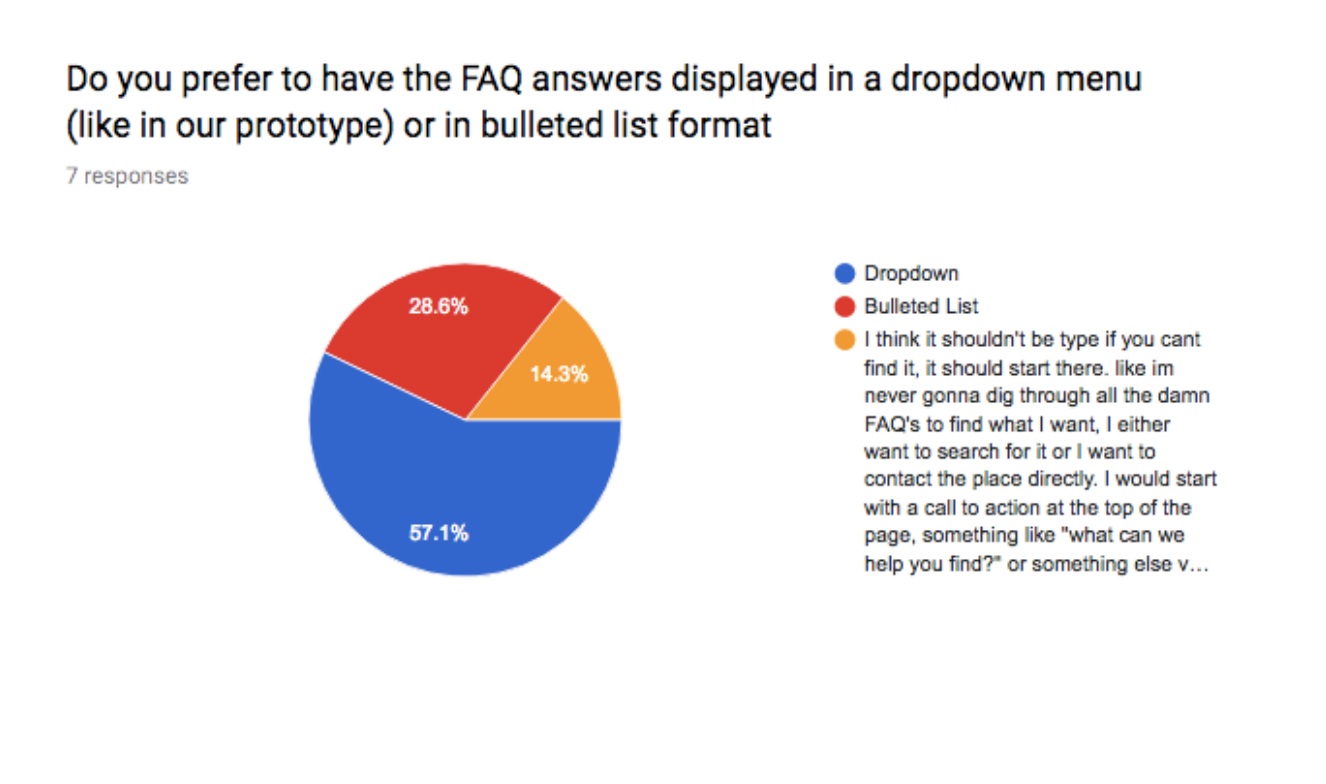
Survey Results- the drop down format for the questions on FAQ pages is the best format to implement for the questions on the page. (The drop down format is what is currently used in the prototype).
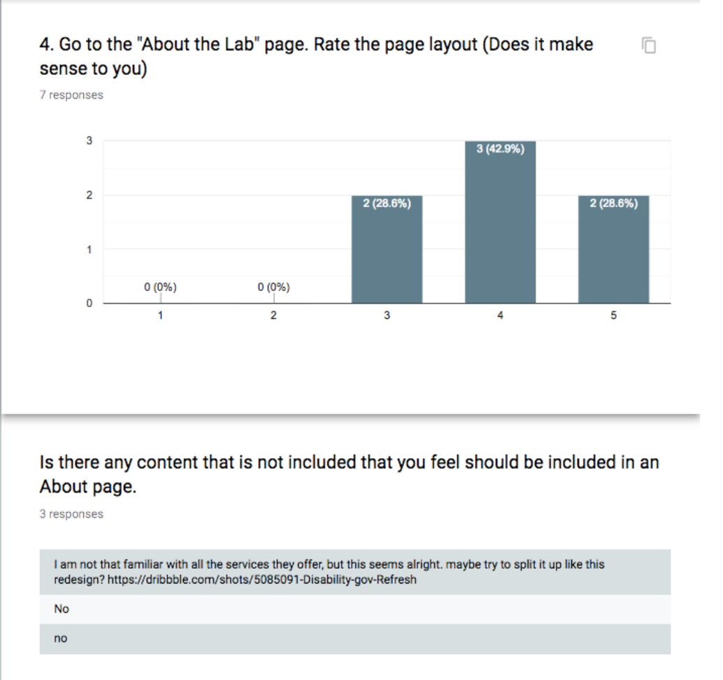
Results
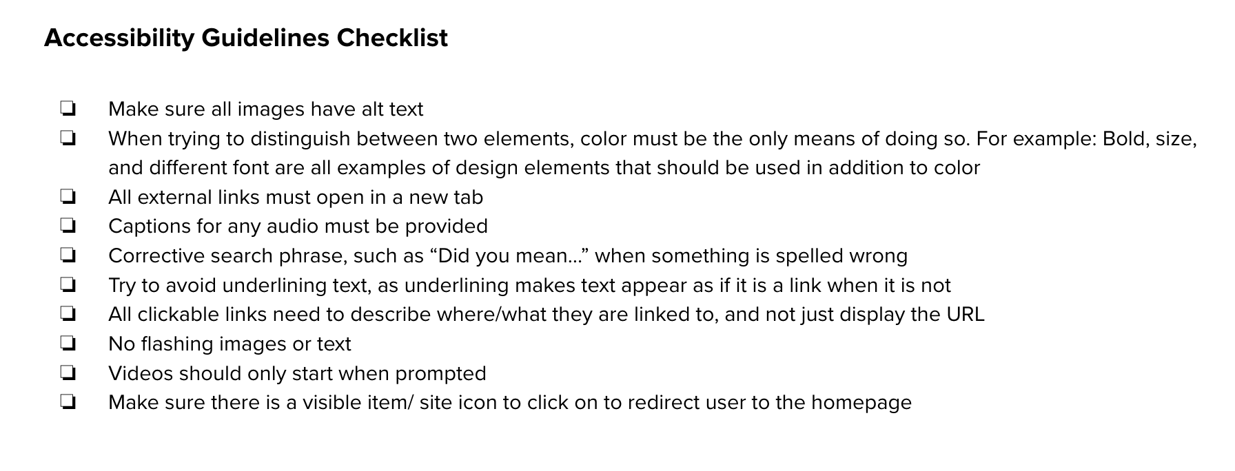
Accessibility Guideline
We Created a list of Accessibility Guidelines for the site designer to use while creating the new format.
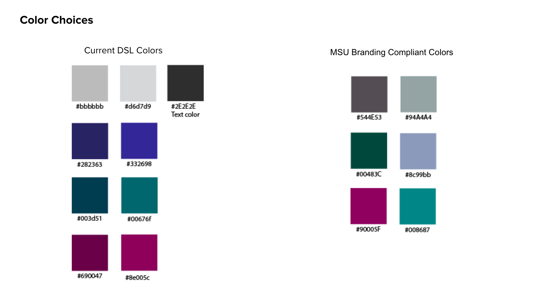
The original DSL site had colors that were not compliant with the MSU Branding. We found similar shades that will blend in with theme.
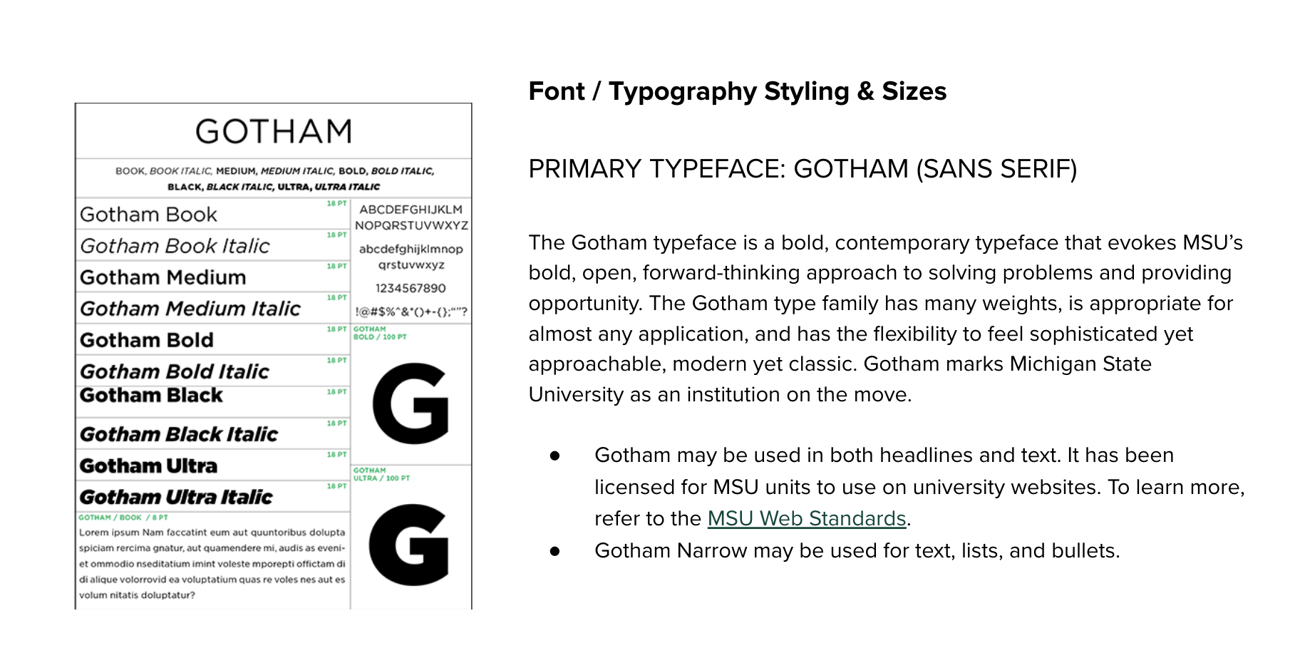
The typography choices were also not compliant. We outlined what should be used for the redesign.
Summary of All suggestions for Improvement
• Reorganization of the Navigation Bar
º Remove Navigation Arrows
• Improve upon FAQ layout
• Update Typography and color to MSU Brand
• Include more icons and images
• Create consistent page layouts
º See pages Connect with Us, Home, and Technology in the Lab
